
Many films that are being released for the first time in high definition are being tampered with in an anachronistic way, which misrepresents both the original film-makers vision and drowns subtle genre traits in a tsunami of modern digital processing. The motivation for this is market pressure, both real and imagined, to produce acceptably ‘modern’ content. We must ask ourselves, should we be experiencing film as a historical artifact or as something that evolves with time and technology?

Orange and Teal is credited with being more ‘involving’ than more natural color schemes.
Historically film was shot on either Tungsten or Daylight balanced film. Natural variation in the film stock led to differences in color even within a single reel. This meant that a single shot could be vary in hue between takes. Further complications associated with changing weather, time-of-day, and the difference between sets and locations meant that shots in a sequence could vary wildly in density and hue.
To resolve these issues it was necessary to run through the edited film applying slight adjustments to the balance of the three primary colors would be used to ‘print’ the final internegative, which would be used to make exhibition prints. These ‘printer lights’ could be adjusted between 0 and 50, where an adjustment of either 6 or 8 stops (depending on the Lab) would equate to one photographic stop. Working out these adjustments took considerable skill, since it was necessary to take into account how over or under exposed the negative was at each point, as well as the characteristic response curve of the print stock being used. The result was an iterative process that often took several days or even weeks to complete.
This whole process, normally referred to as ‘photo-chemical’ color timing, was both expensive and inaccurate. Since the corrections had to be applied to the entire frame it was impossible to perform any kind of selective correction.
Extreme color effects are possible in the photo-chemical space, often through ‘cross-processing’ where ‘positive’ (reversal) film is developed using ‘negative’ process. A good example of this is the film ‘Three Kings’, however this is risky. The produced images may be unsable, and negative insurance, which covers against the risk of the film being destroyed during processing, will be unavailable.
The Birth Of Orange And Teal
In 2000 the Coen Brothers released ‘O Brother, Where Art Thou?’, it represents a milestone in the history of film-making, the first time a ‘big’ feature had been through a digital intermediate. Every single frame of the film was scanned at 2k resolution, and processed in the then state of the art Pandora MegaDef color correction system. The film is sepia tinted throughout.
Digital color correction offered many advantages over traditional photo-chemical processes:
- What you saw in the color correction booth was what you got
- The ability to apply different corrections to different parts of the image (secondary corrections)
- The ability to generate extreme color effects with none of the usual risks associated with those approaches (Bleach-bypass, cross-processing)
Increasingly, main-stream film-makers adopted a ‘digital intermediate’ work-flow, and the ‘Colorist’ became part of the film-making team. Typically one or more digital Colorists would be part of the camera crew, taking direction from, and reporting to, the Cinematographer, who was historically responsible for nursing the film’s image through photochemical post-production. As of 2013, photo-chemical color-timing is all but dead.
HDTV Arrives
Once high-definition television finally took off, there was increasingly demand for content. In the early days this was typically from the same source as most Laserdisc and DVD releases, ‘positive’ print materials already color timed. The quality of the images was better than standard definition, but far from perfect, since the positive print materials were already several generations away from the camera negative. CRT based displays of the late 1990s were unable to make the most of even these imperfect images, so little happened initially.
It was the maturation of Plasma and LCD display technology, with their discrete pixels, it soon became apparent that some of the ‘high-definition’ images were actually pretty soft. Media companies looked to the future, which promised even larger, higher-resolution displays, which would only serve to further emphasize the flaws in the source material. They therefore began the more expensive and complex process of scanning the original camera negatives for many of their catalogue of films, both to preserve them, and to generate future revenue streams.
Scanning from a camera negative creates a few problems, since the negative is not color timed, it is necessary to re-time it. If done with care, and with reference to an original print, this can give a ‘Better than the premiere’ image that skips the generational loss that making film prints typically involves.
By the mid-2000s, Blu-ray had arrived, and beaten off rival HD-DVD. With this new format capable of displaying films at close to their original resolution, and at their original frame rate, Studios felt the pressure to compete on quality.
Against the Grain
Motion picture film has been evolving since its invention in the 1880s, and with each successive generation, the film has typically improved in both ‘speed’ (the ability to capture images in less and less light) and ‘grain’ resolution (the fine pattern of crystals that make up the image). Early color film from the 1960s and 1970s required huge amounts of light. From the mid-1990s things began to dramatically improve, both Kodak and Fuji began producing fast, fine grained films that allowed Cinematographers to shoot with minimal additional lighting at real world locations, freeing them from the confines of Studios.
Media companies confronted with warts-and-all scans of their precious catalogue films worry that people who’d just spend thousands of dollars on high definition displays wouldn’t want to see a grainy image. Additionally the random grain, causes issues with MPEG and H.264 compression, forcing either higher bit-rates or unsightly compression artifacts. The solution was to apply increasingly sophisticated noise reduction technologies to the raw images to remove the grain.
Digital noise reduction (NR , DNR or DVNR) involves modelling a received signal as consisting of both desired signal and noise. Algorithms can be defined to describe particular kinds of noise, either spatially or temporarily, relying on the fact that real picture information is both spatially and temporarily correlated, whereas noise is not correlated. Spatial techniques alone tend to give poor results. Better results are given by adaptive temporal algorithms that rely on building an understanding the motion of objects in the scene to determine if a particular pixel represents grain noise or an eyelash.

Sabrina, without and with DVNR. Impressive, yes – but is it truth ?
Profit Motive
Since this scanning, noise reduction and color correction require specialist skills, rather than maintain an in-house staff, it is typically sub-contracted outside the film studio. These external specialists are, of course, competing with each other for work. One way they can do this is to turn out results that were pleasing to the studio executives eyes. So rather than correcting the image to a true historic reference, colorists would work toward a more modern sensibility. But what is a modern color-corrected sensibility ?
Over time as color-correction, like fast-editing and deliberate ‘shaky cam’, became a staple of modern film-making, certain trends began to emerge. One very common trope is to create a high contrast image by pushing flesh tones toward orange, and pretty much everything else towards and teal/blue. In Color Theory, this is a two color complementary scheme. Orange and teal works well, since you need a flesh tone (orange), and the direct complement of a flesh tone is teal. The contrast between the two complementary colors, really makes the characters pop out of the scene. Additionally it’s pretty easy for the art department to understand: people and important things are orange, everything else is teal. The Transformers films really showcase the technique.

From top to bottom: The Big Blue, as originally released vs the recolored teal Blu-ray. The Terminator as originally released and recolored teal and orange.
Unfortunately it seems to spring up pretty much everywhere at the moment. Given the flexibility of the color correction tools available, it is a little bit pathetic that a lot of films choose the same palette. What’s worse is that it has slowly been creeping into Blu-ray releases of older films.
While I certainly agree that the technique is artistically valid, retro-fitting it to older films is abhorrent.
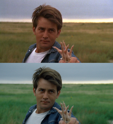
‘The Terminator’ was a low-budget high-concept science fiction film. An action/special-effects heavy picture produced for a shoestring budget of 6 million dollars in the same year that Beverly Hills Cop was made for 15 million dollars. The film is a triumph of technique over limited resources. A recent Blu-ray release of the film has introduced color timing changes that subtly suggest a more modern ‘orange and teal’ aesthetic. Now instead of looking like a low budget 80s action film, it has the colors of an early 2000s action film. ‘Aliens’ has suffered a similar fate.
Another example is Luc Besson’s ‘The Big Blue’. Comparing the original release of the film to a recent Blu-ray reveals a distinctly teal look that could have only been achieved in a 21st century color correction suite in a late 20th century film.
Director Heal-Thyself
But the worst problem is the directors themselves. Technology has enabled directors to revisit films relatively cheaply and make small tweaks here and there. In some cases this has been done at the same time as the films have been retrofitted for 3D. The poster child for this particular disorder is George Lucas, whose changes to both the original Star-Wars Trilogy, and THX-1138 defy logical explanation. Lucas himself said in 1988 with no trace of irony:
In the future it will become even easier for old negatives to become lost and be “replaced” by new altered negatives. This would be a great loss to our society. Our cultural history must not be allowed to be rewritten.
The latest versions of the Star Wars films are all ‘director approved’ editions. Even if the director wants to graffiti all over the Oscar recognized work in Visual Effects, Film Editing, Score and Sound Design.
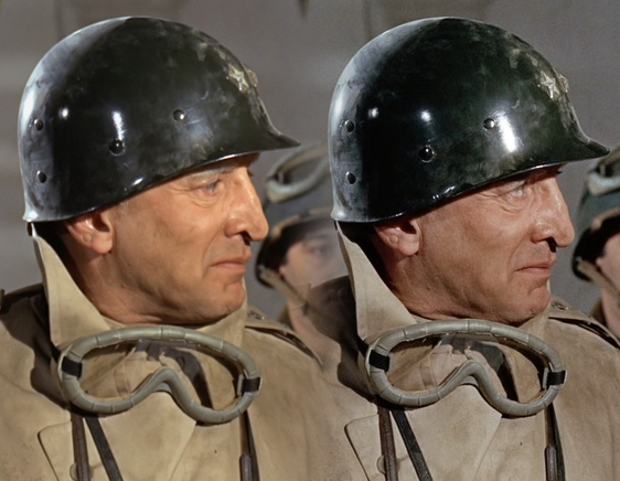
Nobody is immune: bottom is Criterion’s Blu-ray release of the Terrance Mallick approved transfer of Badlands
The problem is a ‘remastered’ 7.1 channel soundtracks. Until the 1980s it was pretty typical for films to have a monophonic optical soundtrack. Tent-pole pictures would sometimes have exotic multi-channel audio (see Sensurround), but for most features mono was sufficient. Even through the 1980s 4-channel Dolby Stereo was common, even on high budget action films. With the pressure to compete in a post credit-crunch market places, studios feel pressure to deliver 7.1 channel sound, even on movies that never had even stereo in the first place.
This is typically done cheaply where dialogue, music and effects sound tracks exist as separate items, and arguably doesn’t dilute the film makers intentions, especially when they are offered in addition to, rather than instead of, the original monophonic soundtrack. However, frequently things go wrong here. Sound effects are often replaced or forgotten, dialogue disappears or alternative takes are used, sound levels are altered.
It would be trivial to include ‘original’ cinema soundtracks on Blu-rays, since a compressed mono soundtrack recorded at a generous 128 kilobits per second would only occupy about 120 megabytes, or less than half of one percent of the space on a single-layer Blu-ray.
In A Hundred Years What Will A 1980s Movie Look Like ?
These may seem like small things, but are damaging when placing a film in a historical context, especially when the original sound design was Oscar winning. The sad thing is that in a hundred years time, the only copy of Badlands in existance may be the Criterion Blu-ray.
The problem is a loss of texture. The only copies of 1980s films are grandchildren are likely to see will have a 1980s base, with a layer of 1990s revisionist editting, an early 2000s remixed soundtrack and an 2010s coat of orange and teal paint.
So now we have classic movies that are freed from the limitations of their time, presented grainlessly with modern hues and color choices combined with booming multi-channel sound-tracks produced by the lowest bidder as part of a purely commercial process to provide product for consumption.
There are some signs that all is not lost. In May 2009 Fox released a Blu-Ray disc of Patton, a seven Oscar winning film. The edition had large amounts of DVNR applied to the point that the main character looked more like a plastic action figure than a real person. After considerable Internet hot-air, the disc was re-issued in a much better state.
- Patton on Blu-ray, left as originally released with excessive DVNR, right as ‘re-mastered’ (not precisely the same frame)
I’ve compiled a list below of ‘enhanced’ discs where the colors or grain have been ‘re-educated’ for Blu-ray, the list also includes a recommended disc that represents the best choice to see the film as it really was. Some of these discs may be either out-of-print, or require an all-region DVD/Blu-ray player. Buyer beware.
| Title | Problems | Best Version To Own |
|---|---|---|
| Alien | Modern color correction | Alien Quadrilogy DVD |
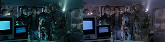
| Aliens | A minor case of orange and teal. | Alien Quadrilogy DVD |
| Apocalypse Now | Redux cut is both a different cut and recolored. | Laserdisc - All previous editions are 2.0:1 but are the original cut, and color. |
| Badlands | Criterion disc is recolored based on input from the director. | Old DVD |
| Big Blue, The | Orange and teal | Laserdisc ? |
| Fight Club | General monkeying about, black levels crushed, a few digital fixes to blown out skies. | Fox 'Brown Paper' DVD |
| Game, The | A good hard orange-and-tealing on the latest Criterion. | UK Blu-ray |
| Leon | Crushed blacks, and an odd green or yellow tint depending on the scene. | Columbia Tri-Star DVD |
| Matrix, The | Green tinted to match the rest of the trilogy | The original single disc DVD |
| Nikita | ? | ? |
| Predator | Bad DVNR | Older Blu-ray |
| Raiders of the Lost Ark | Any of the earlier DVDs | |
| Se7en | General monkeying about with the image, including orange and teal. | Dutch Blu-ray release is probably first choice. But a complex question. |
| Terminator, The | Orange and teal | Older Blu-ray |
Notes
All images are the property of their respective copyright owners, and are reproduced here under the doctrine of fair-use for purpose of critical comment. If you object to the use of material you hold copyright on, please send me an email and I’d be happy to discuss taking it down.