Many films that are being released for the first time in high definition are being tampered with in an anachronistic way, which misrepresents both the original film-makers vision and drowns subtle genre traits in a tsunami of modern digital processing. The motivation for this is market pressure, both real and imagined, to produce acceptably ‘modern’ content. We must ask ourselves, should we be experiencing film as a historical artifact or as something that evolves with time and technology?

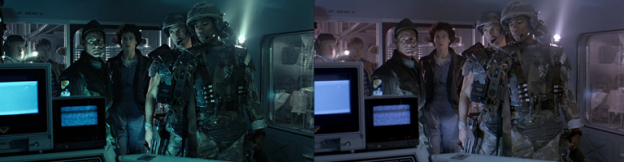
Orange and Teal is credited with being more ‘involving’ than more natural color schemes.
Historically film was shot on either Tungsten or Daylight balanced film. Natural variation in the film stock led to differences in color even within a single reel. This meant that a single shot could be vary in hue between takes. Further complications associated with changing weather, time-of-day, and the difference between sets and locations meant that shots in a sequence could vary wildly in density and hue.
To resolve these issues it was necessary to run through the edited film applying slight adjustments to the balance of the three primary colors would be used to ‘print’ the final internegative, which would be used to make exhibition prints. These ‘printer lights’ could be adjusted between 0 and 50, where an adjustment of either 6 or 8 stops (depending on the Lab) would equate to one photographic stop. Working out these adjustments took considerable skill, since it was necessary to take into account how over or under exposed the negative was at each point, as well as the characteristic response curve of the print stock being used. The result was an iterative process that often took several days or even weeks to complete.
Continue reading →